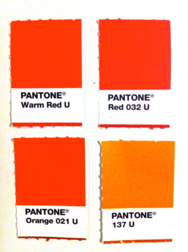
Picking colors is so hard and so fun at the same time. That said, there are three things you should keep in mind:
The competition.
Do not pick the same color as your closest competitors. One would think that this goes without saying, but one would be mistaken (I'm talking to you, financial services companies that all want the same blue.)
Go with the strategic choice
It may not be your favorite color, but if it makes sense strategically (e.g., it communicates the right feel and it is appealing to your audience and it doesn't make you vomit), what your designer is recommending is probably a good choice.
Look at it onscreen
Obviously, it needs to be visible onscreen. That's why pale yellow isn't great but a deep gold can be awesome. Also, remember to practice a Zen attitude about consistency because you simply cannot pick a color that will appear the same on all screens.